L'âme fragile
Françoise Pétrovich
Book Design


CONTEXT
Françoise Pétrovich is a French artist known for her monumental oil paintings and serene watercolour artworks. Her work touches on themes of vulnerability, fragility, and love.
mandate
Design a new artist booklet that explores the theme of vulnerability through the layouts and book cover and guides the viewer through Pétrovich's journey and career.
APPROACH
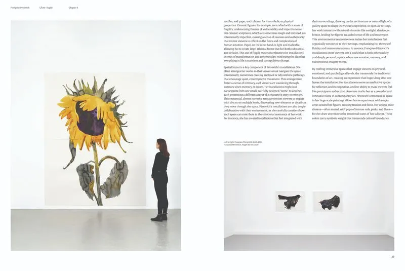
I started my process by diving deeper into Françoise Pétrovich's body of work. I researched her background, watercolour techniques, interviews, and website to learn more about the artist. Studying her profile and approach helped me connect with the subjects depicted in each painting, especially when they caressed each other or interacted with small animals. The research inspired a book exploring themes of fragility and intimacy and helped me select artworks that complemented this concept.
RESULT
I chose a blue spine to signify peace and serenity, complementing the book's mood. The typeface with adjusted tracking facilitates legibility, while the serifs and elegant strokes evoke tradition, fitting for the artist's work. I used my grid to create breathing space for Pétrovich's paintings, such as dedicating a page to one artwork, a spread of multiple drawings, or small image thumbnails.